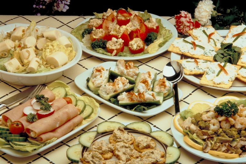
Infographics: The hors d’oeuvre buffet
My current obsession: infographics. So what’s fueling this?
Louise Maine (aka @hurricanemaine) and I have worked on our ISTE 2012 presentation since last fall, a year long journey using infographics in her ninth grade bio class. This is also evolving into several new pages of content for TeachersFirst (TBA). I find myself grabbing more and more great infographic examples, tools, and discussions: what makes a “good” infographic, how they can structure and assess learning, and who is creating good ones out there in marketing land.
I have always liked infographics, and I don’t think it is because I am a visual/design person. I think it is more because infographics are like an all-you-can-eat hors d’oeuvres buffet. JP Rangaswami gave a terrific TED talk, Information is Food, where he explained his gustatory analogy. His question about whether information will start coming with nutritional labeling to indicate its “fact” ( fat?) percentage is particularly appropriate and witty. Funny how my mental analogy independently went to infographics also something edible. Imagine how validated I felt to find the TED video!
At the infographic hors d’oeuvre buffet, you can sample small bits of information, take an extra serving of the stuff you like, and walk past the chicken livers. You can stop to savor one bit of data like a foodie or enjoy taking all of it in. None of the servings is so large that it fills you up, but you might overstuff yourself if you try to absorb too many databits. (Try the Cool Infographics blog to overindulge.) I think we like infographics because they don’t commit us to a full meal, but we can satisfy our cravings.
I do wonder how many of us actually read everything in an infographic, especially the text-heavy ones like this. I much prefer the less textual ones like this. I would guess that the typical read-rate is about 20%. That’s about what we try at an appetizer buffet, right? It’s probably a good thing that none of us receives either a nutrition profile or a comprehension rating on what we ingest from infographics. We simply enjoy the tastes.


I, too, am obsessed with infographics. I wish I could attend ISTE 2012 to see your presentation. I am sure you have but in case you or your readers haven’t, check out Kathy Schrock’s page about using infographics for assessment – http://www.schrockguide.net/infographics-as-an-assessment.html . One thing I always try to look at is the source for the data included in the infographic. It can really help identify any bias in the data being used. Thanks for the article!
Comment by Wanda Terral — May 18, 2012 @ 1:45 pm
Wanda,
I saw Kathy’s presentation on infographics at ISTE last year. It was great…and I’ve seen the useful collection of resources she has. One things shoe commented on in her preso was her self-assessment that she is not an artistic person. Working ith Louise as a “data” person has helped me articulate the visual/artistic things I bring to making infographics, and that is one things we plan to talk about. The collaboration with another teacher on infographics — since we have such different “views” — has only increased my fascination.
Source of data is definitely an important filter to check. Some infographics I find online seem to come from web myths!
Comment by Candace Hackett Shively — May 18, 2012 @ 2:10 pm