I spent most of the weekend prepping for one of my #ISTE11 presentations, “Cycles vs. Checklists: Fostering Creative Process in an Accountability World,” In the process, I learned a few things that actually became part of the presentation:
- one place is better than multiple places
- color coding works
- I never have to throw anything away
One the the best things about submitting ISTE proposals a eight or nine months before you actually give the presentation is the delightfully long incubation time to pull the presentation together in your head, make it better, let it evolve to a higher plain. During the time from acceptance (December) to delivery (June), you collect, refine, do more research, talk to colleagues, read, read, read — and eventually create. At some point, it seems that everything you run across in your browsing and tweet-reading relates to what your upcoming presentation topic.
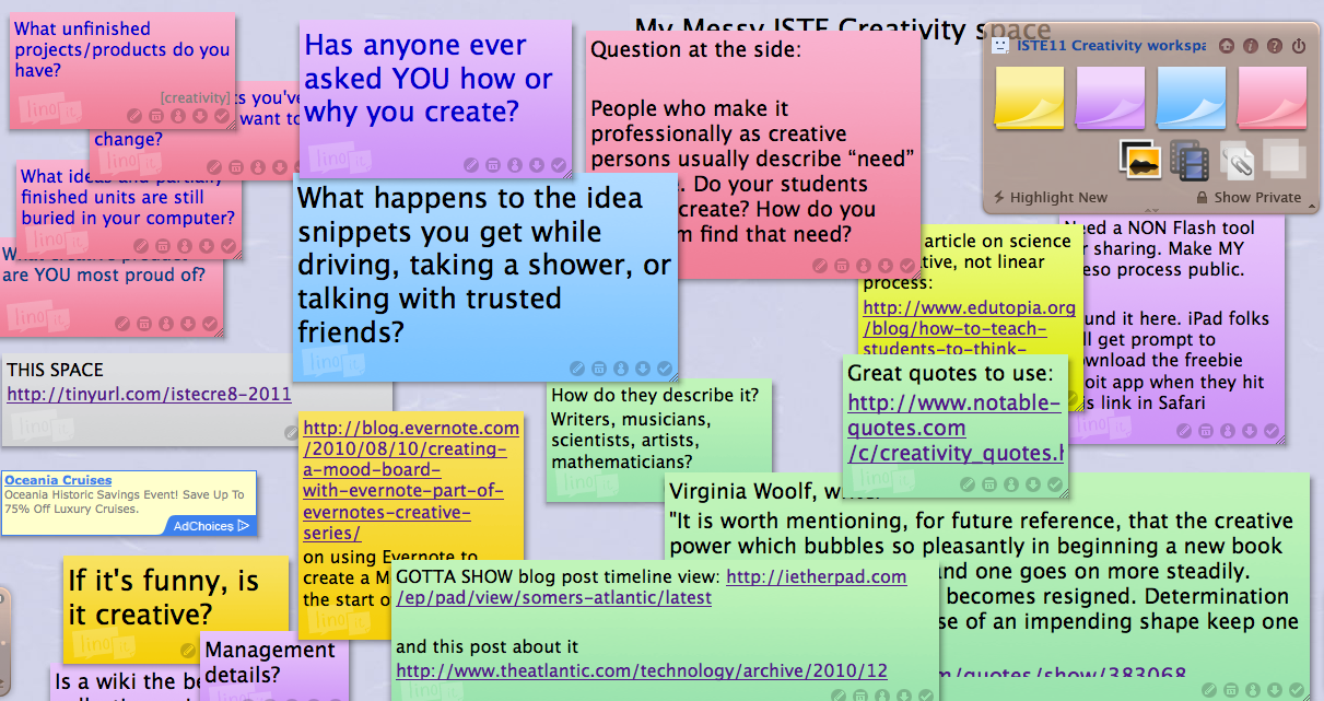
Along the way, you grab ideas and toss them into storage. In my case, Diigo seemed great at first because I could tag and add notes on the angle that particular image or article or video provides on creativity and creative process. But I also had my own ideas popping into my head: pithy things to say, questions to ask, things I wonder about, etc.– all related to the preso topic. So I jotted some of them in a word doc on my cluttered desktop. About three months out, I also began a linoit wall– they call it a “canvas”–* which I dubbed my “idea bin.” I filled it with stickies and video clips and links, all related to the preso topic. [*I chose linoit.com over Wallwisher because it has an app version for iOS users. Wallwisher uses Flash so would prevent the iPad folks from “seeing” and participating in the space. I considered Evernote, but I like the ease of lino.it for newbies. I also wanted to try something new to learn it.] Unfortunately, my own lack of consistency meant my idea collections were in three places. The lesson I learned: when it comes time to cull, arrange, and construct the actual presentation, three attics filled with ideas are unmanageable. I had duplicates, lost things between the cracks, and wasted a lot of time.
Having learned that lesson, I tossed almost everything into my linoit “idea bin,” with the intention of sharing it during the preso as a model. The result is a very cluttered space, especially it you are an outline-style person, which I am not. To help myself out, I found that color coding was huge! I sorted by making the “thinking question” stickies one color, the “MUST include” quotes another color, and so forth. If I had been really organized, I would have used tags on each sticky to sort, but I am visual, so I went for color. I even played with fonts and shrinking the relative size of less important ideas. Note that I intentionally did not “finish” color coding/sorting so people could see an idea-bin-in-progress. I LOVE this process and will use it again. It fits me.
An added benefit: That idea bin isn’t going anywhere. I don’t have to throw anything out! I still have all the unused ideas as fodder for blog posts, future presentations, articles, maybe even a book. I am an idea hoarder, and having an omni-present, accessible place to throw things is right up my alley. Another lesson learned.
I have learned more than I could ever share about my topic, something about a tool, and something about myself in the process of preparing this presentation. And isn’t that what we want our kids to do?
If you are going to ISTE, I hope you will join me Wednesday, 6/29/2011, 10:15am–11:15am PACC 204B. If not, You will be able to see loads of related materials and resources — the equivalent of “handouts”– on the presentation support pages after June 29.


